
This annual report is compiled & pulled from data from the period 1/1/2016 to 12/31/2016.
This is the 9th year Lillian has published an annual report. These go out in the mail (for free!) to friends who sign up for the mailing list. If you’d like to receive zines, please sign up here.
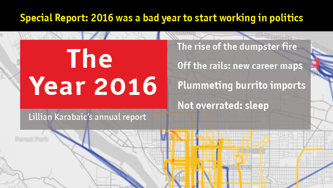
This report was inspired by the design of The Economist magazine and was produced in Adobe InDesign. The fonts are the Officina Sans & Officina TT suites. The transit map font is InfoText BB. Plane icon by Yeoul Kim & list icon by Artworkbean from Noun Project, used under creative commons license.
The report comes from data collected between 1/1/2016 and 12/31/2016.
Movement & GPS data were collected using Foursquare’s swarm app and Moves on an iPhone 4S & iPhone SE. Geodata was visualized using Moves-o-Scope, TileMill, and MMapper.
Data on sleep, caffeine, alcohol, mood, weather, burritos, and miles biked were collected “manually” in the Lumen Trails Daily Tracker app and were visualized using R and Adobe Illustator. All data analysis was conducted using SQL, Numbers, and R. Financial data was collected, analyzed, and visualized by YNAB 4 with some help from Adobe Illustrator.
The average day wheels were inspired by Nicholas Feltron’s annual report.
Aaron Parecki contributed invaluably to the visualization of the sleep data using PHP (and some lovely hand data cleaning.)
This report, which is the 9th annual quantified self report by Lillian Karabaic, involved 31.6 hours of design, 5.4 hours of writing, and 6.2 hours of data work.
Special thanks to Aaron Parecki & Dora for data & cuddle support (respectively) and Cameron Booth for his transit map design tutorial.





Averaging three tacos per day should enter you into the national taco championship.
Haha! I eat them for breakfast every morning. Costs me ~15 cents per taco, and is fast & full of delicious protein!
I just LOVE this.
❤️
❤️
❤️
I received mine! It was a delightful surprise to find it in my mailbox at the end of a long day. Thank you : )
This Article was mentioned on brid-gy.appspot.com
Very nice, indeed.
This report combines meticulous data tracking with creative design, reflecting Lillian’s dedication to both data analysis and presentation.
Every piece of data, no matter how small, contributes to building a comprehensive picture of Lillian’s life and activities in 2016, presented aesthetically and scientifically thanks to professional graphic tools and sophisticated analysis processes.
mobile devices and browsers
You can grow pets and live with them in the game. Characters can be happier with pets.
SQL, Numbers, and R were used for all data analysis. YNAB 4 was used to gather, analyze, and illustrate financial data with some assistance from Adobe Illustrator.
The immediate and gratifying response you get from your strokes in Golf Orbit is quite remarkable. The graphics and audio in this thrilling golf game update in real time as you make adjustments to your approach or hit the hole in one.
That’s so cool! Tell me more about it. :)
The Temple Run game provides an immersive and captivating running experience, appealing to gamers of all ages with its remarkable visuals and rapid action.
This annual report for the Year 2016 has the best ideas, and it is good to use these to learn. There are people who know how to deal with these issues, and it provides us with the results.
Wow, the level of detail in this annual report is impressive!
This blog series is interesting. Articles are coherent with individual highlights. The systematic sharing is great. Looking forward to more great works.
So much valuable content!It’s obvious that the blogger has spent a lot of thought on details.
Great writing skills!It is not only easy to read but also makes the content more rich and interesting.
So much valuable content!The language style is relaxed and humorous, making it stress free to read
Incredible dedication and design! Love how data, personal insight, and creativity come together—such a unique and inspiring annual tradition.
Considering how brilliant and unique your idea is, I believe that it will be replicated and used as a source of inspiration for the development of a great deal more ideas.
2016 was a year of many changes, and economic turning points. Hopefully, the future will have many changes to improve people’s lives.
Great writing skills! The descriptions are delicate and vivid, easily creating
It is not only The systematic sharing is grea more rich and interesting.
The systematic sharing is grea more rich and interesting.
This blog series is interesting. Articles are coherent with individual highlights. Video to PromptThe systematic sharing is great. Looking forward to more great works.
This is a cool project! I admire the dedication to tracking all that data.
This community is a great place to learn and grow.
I like how everyone is contributing their own experiences here—it makes the topic even richer.
I really appreciate your perspective on this topic.
Thanks for creating such a supportive space.
I appreciate the effort you put into writing this.
Thank you for providing this information. I enjoyed your blog post very lot. You have given a very educational and entertaining blog post to people.
This annual report is amazing! The attention to detail, from design to data collection, is impressive. I love how personal habits, travel, and even burritos are tracked. It’s inspiring to see such a thorough, well-presented self-analysis.
This is such a charming, nerdy-labour-of-love kind of project — a handcrafted zine that treats a whole year of life like a data story. I love how the tools range from SQL and R to TileMill and InDesign, but it still feels very personal and human, not just “quantified.”
I love that you’ve been doing this for 9 years now — there’s something really special about having a tangible record of your year. I always look forward to these mailouts. The detail you put into documenting your experiences really comes through, and it makes me want to be more intentional about keeping track of my own life. Have you ever thought about turning any of these reports (Seedance2)
I appreciate the way you explained this topic—it’s clear.
This is a great topic, thanks for sharing.
Thanks everyone for sharing your experiences, I’m learning a lot here.
Wow, this annual report for 201 Check out https://7dsocodes.org/ for more on this topic.
However, Livuxis works well as a liver support tablet for daily health and. It is effective in maintaining the health of the liver and overall well-being. I like the fact that it is herbal and does not weigh heavily on the body. If you are looking for something simple and effective for the liver, then this is a good option.
I always find it fascinating when someone commits to documenting their year like this. The idea of compiling 12 months of moments, data, and reflections into something tangible is both nostalgic and practical (seedance notes). There’s something about flipping through a physical zine that digital formats can’t quite replicate. I imagine 2016 had its fair share of ups and downs, and having that record preserved feels like giving your past self a voice. Anyone else keep a similar yearly archive?
The collaboration between Siemens and SAP for energy asset management makes a lot of sense, especially with all the pressure on energy companies to hit sustainability targets while keeping costs manageable. I’m curious how their joint platform actually handles the data integration across both ecosystems in practice—does it feel seamless or are there still friction points during deployment? On a somewhat related note, I’ve been experimenting with Seedance 2 (Seedance 2.1). 1 for creating short explainer clips about industry topics, and the results have been surprisingly usable for internal presentations.
Nine years of annual reports is honestly impressive consistency, and mailing them out for free is such a personal touch (supporting link https://vidcio.com/text-to-video ). I used to do yearly recaps on my old blog but fell off after year three. Seeing something like this makes me want to pick the habit back up. I did end up using a free AI video generator from text to put together a little visual recap for myself, and it made the whole process way more fun than just writing paragraphs.
The annual report is compiled and pulled from data that you have shared here is good and motivational for the people who like to read and learn from these reports. When I saw many people are searching for these updates they come here and get what they are in need of.
One thing I really liked about the website explaining BHULEKH BIHAR was how beginner-friendly it felt. Even without prior knowledge, I understood the process easily and found my required details in just a few minutes.
Glad I found this forum/blog. The community here is so supportive!