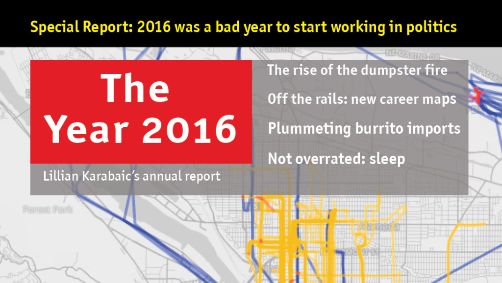
This annual report is compiled & pulled from data from the period 1/1/2016 to 12/31/2016.
This is the 9th year Lillian has published an annual report. These go out in the mail (for free!) to friends who sign up for the mailing list. If you’d like to receive zines, please sign up here.
This report was inspired by the design of The Economist magazine and was produced in Adobe InDesign. The fonts are the Officina Sans & Officina TT suites. The transit map font is InfoText BB. Plane icon by Yeoul Kim & list icon by Artworkbean from Noun Project, used under creative commons license.
The report comes from data collected between 1/1/2016 and 12/31/2016.
Movement & GPS data were collected using Foursquare’s swarm app and Moves on an iPhone 4S & iPhone SE. Geodata was visualized using Moves-o-Scope, TileMill, and MMapper.
Data on sleep, caffeine, alcohol, mood, weather, burritos, and miles biked were collected “manually” in the Lumen Trails Daily Tracker app and were visualized using R and Adobe Illustator. All data analysis was conducted using SQL, Numbers, and R. Financial data was collected, analyzed, and visualized by YNAB 4 with some help from Adobe Illustrator.
The average day wheels were inspired by Nicholas Feltron’s annual report.
Aaron Parecki contributed invaluably to the visualization of the sleep data using PHP (and some lovely hand data cleaning.)
This report, which is the 9th annual quantified self report by Lillian Karabaic, involved 31.6 hours of design, 5.4 hours of writing, and 6.2 hours of data work.
Special thanks to Aaron Parecki & Dora for data & cuddle support (respectively) and Cameron Booth for his transit map design tutorial.


Averaging three tacos per day should enter you into the national taco championship.
Haha! I eat them for breakfast every morning. Costs me ~15 cents per taco, and is fast & full of delicious protein!
I just LOVE this.
❤️
❤️
❤️
I received mine! It was a delightful surprise to find it in my mailbox at the end of a long day. Thank you : )
This Article was mentioned on brid-gy.appspot.com
Very nice, indeed.